Building data interfaces that tell stories to drive action
Discussion on how data can tell stories, the difference between descriptive and prescriptive data today and where they fall short.
Dashboards with data. Every company has them, we have major tools that help us make dashboards, but most, if not all, follow the same pattern. Multiple tiles that centralize data in one place for the reader to track whatever goals it is they may be tracking. But is this really the right approach? In the world of design and marketing, we constantly talk about telling a story and how the product or feature relates directly to a problem the user is having. This method of course helps sell the product as a solution.
Now we have to ask ourselves, why haven't we taken this approach to greater heights when it comes to analytical and data tools? Let's deep dive into the problems here and see how we can build a framework that enables us to create strong storytelling data interfaces.
Descriptive data
When we look at the majority of dashboards that exist, most of them are in the category of descriptive data. It brings in averages, totals, percentages, and other useful metrics for the user to understand the overall picture of the data they are looking at. For some datasets, this may be enough. For others? Not so much. Descriptive data leaves users with the task to uncover the root causes of a dip in their data or data that doesn't add up on what they expected. This sometimes means looking through three or four different data points to understand what's actually going on.
Descriptive statistics are a set of brief descriptive coefficients that summarize a given dataset representative of an entire or sample population.
I believe this high-level descriptive dashboards happen because most analytical products are generalized for wider adoption. Depending on the industry and purpose, it may be difficult to bring in various data sources, or accurately understand outside factors influencing the data. For many however, we can upgrade the second tier of experiences, which is prescriptive data.
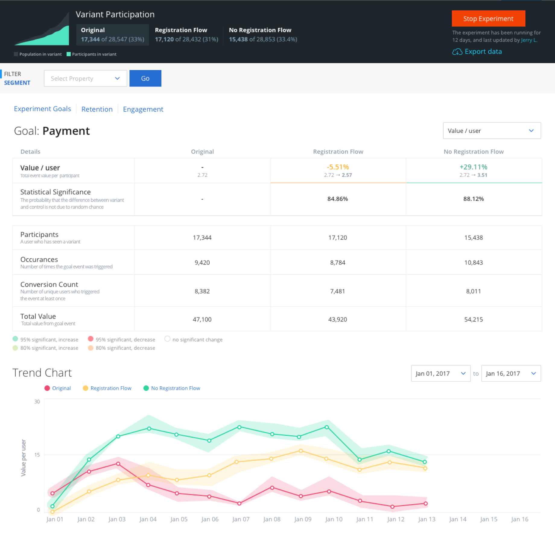
Prescriptive data
Prescriptive data is where most products try to be, especially in this age with the advent of AI tools. Prescriptive is where the tool will try to drive action from the user based on the data and what they should do next. Prescriptive is where we get suggestions on what to do next.
Prescriptive analytics is the practice of analyzing data to identify patterns which can be used to make predictions and determine optimal courses of action.
This is where the challenge is. Most prescriptive analytics tools and dashboards simply reiterating what the user can infer from the data displayed. This type of inference often only takes into account the data that is portrayed alongside the insight, and doesn't go beyond this scope of data.
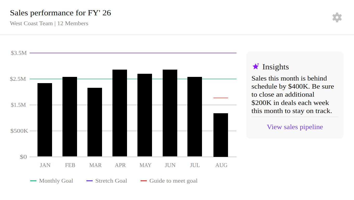
In this blog post we will box in the definition of prescriptive data to this: The action derived from a single data point across a larger system. This allows us to start building the next phase of analytical tools, which in this case would be the ones that tell a story.
Storytelling with data
Data that tells a story is a powerful way to give a reader an understanding of exactly what's happening. In previous years this may have proven an impossible task, but today with so many API connections and AI, this should really become the norm. But before we start, we must understand how to break apart our dashboard into two different categories: historical data and relevant data.
Historical data
Historical data is simply the data that may be used for sharing reports of progress, but isn't relevant to now. Given our sales chart above, all the previous months are irrelevant to how our operations are today. It simply shows progress. This is also what I like to call dead data. If you analyze a dashboard and take out all of this data, you may find that around 80% actually consists of this type of data.
Dead data of course is very useful for reports, setting long term expectations, and understanding how your business, team, or yourself has progressed over time.
Active data
This is as you would expect, the direct opposite of dead data. Active data are points that can be used right now to make a decision. You don't need to know the sales numbers four months ago to direct your team on how to achieve their sales goals for this month. But you definitely need to know what resources you have, vacations that may be coming up, and other factors that will impact sales, this is considered active data.
Active data may consist of some historical data, and may entirely be based on use case. For example you previously ran a marathon in two hours and you want to improve, you may see a comparison of each run with the previous run. This all depends on the cadence of data and the term of usefulness for historical data with active data. This must be defined by your specific use case.
Setting the stage for storytelling
Building the foundation for storytelling data requires us to draw a clear line between active and dead data. Ideally this means that we will have a dashboard for active data, and a reports page for building reports on historical (and current) data. It's also imperative that we understand the customer use cases on a deeper level and the different sources of data we have access to that can be used to build a story.
Once the use cases, data sources, and how they are related are understood, we can build a stronger action driven dashboard like the example below.
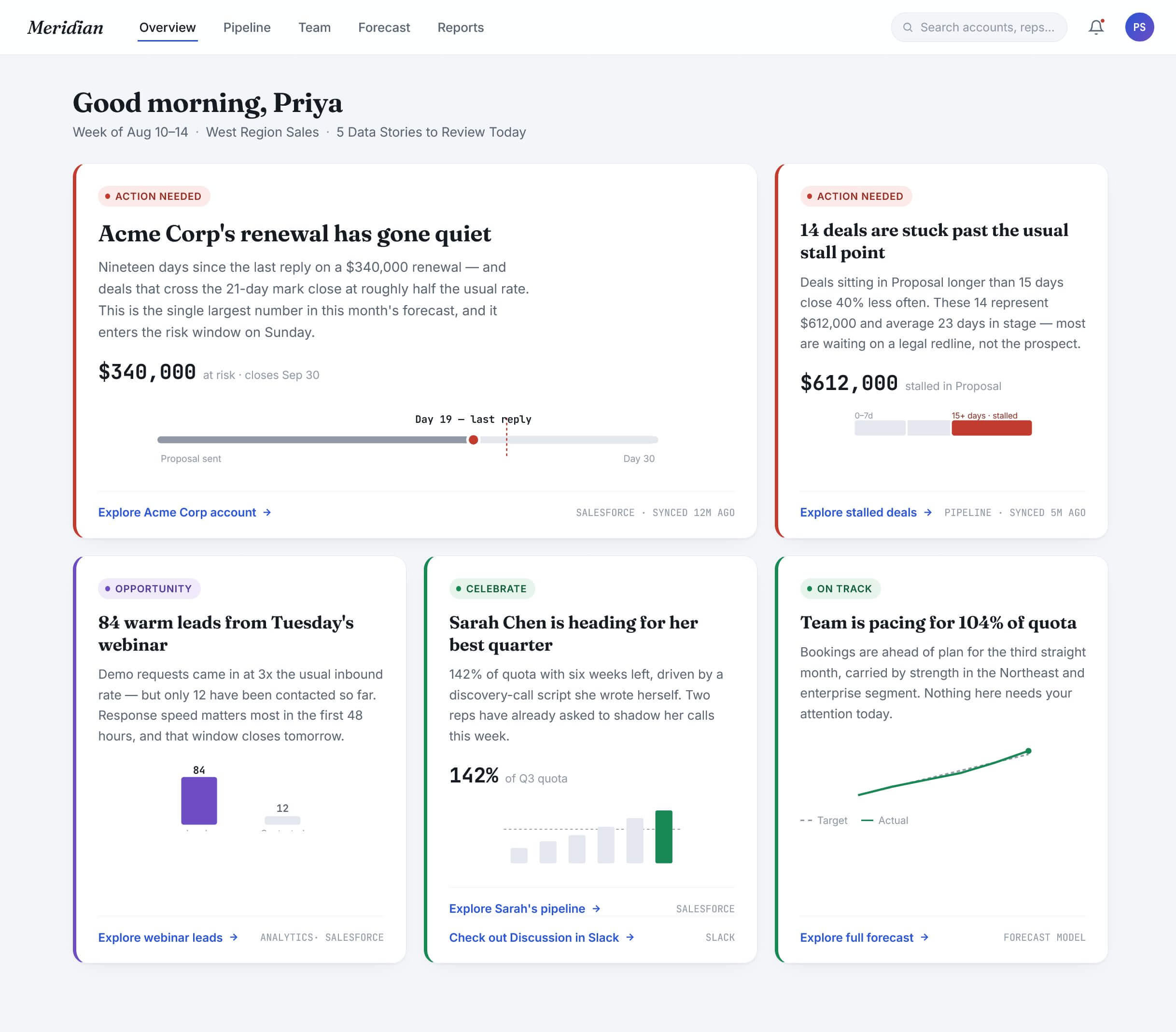
We can see that each tile shares a story, explains the reasons, and gives sources as well as an action. This page is completely dynamic, and will change throughout the day, week, month, etc. As issues are resolved or addressed, the tiles will disappear. Action driven, outcome focused.
In some scenarios, it may be useful for the product to ask questions so it can make a stronger case and build the story more accurately. Below is an example mockup of a fitness application with this very feature. Most fitness applications simply ask a generic how did you feel? After that it simply logs the run and thats it. This concept builds on this to not only ask how you are feeling, but takes into consideration your pace, weather, and past data in order to prescribe a course of action.
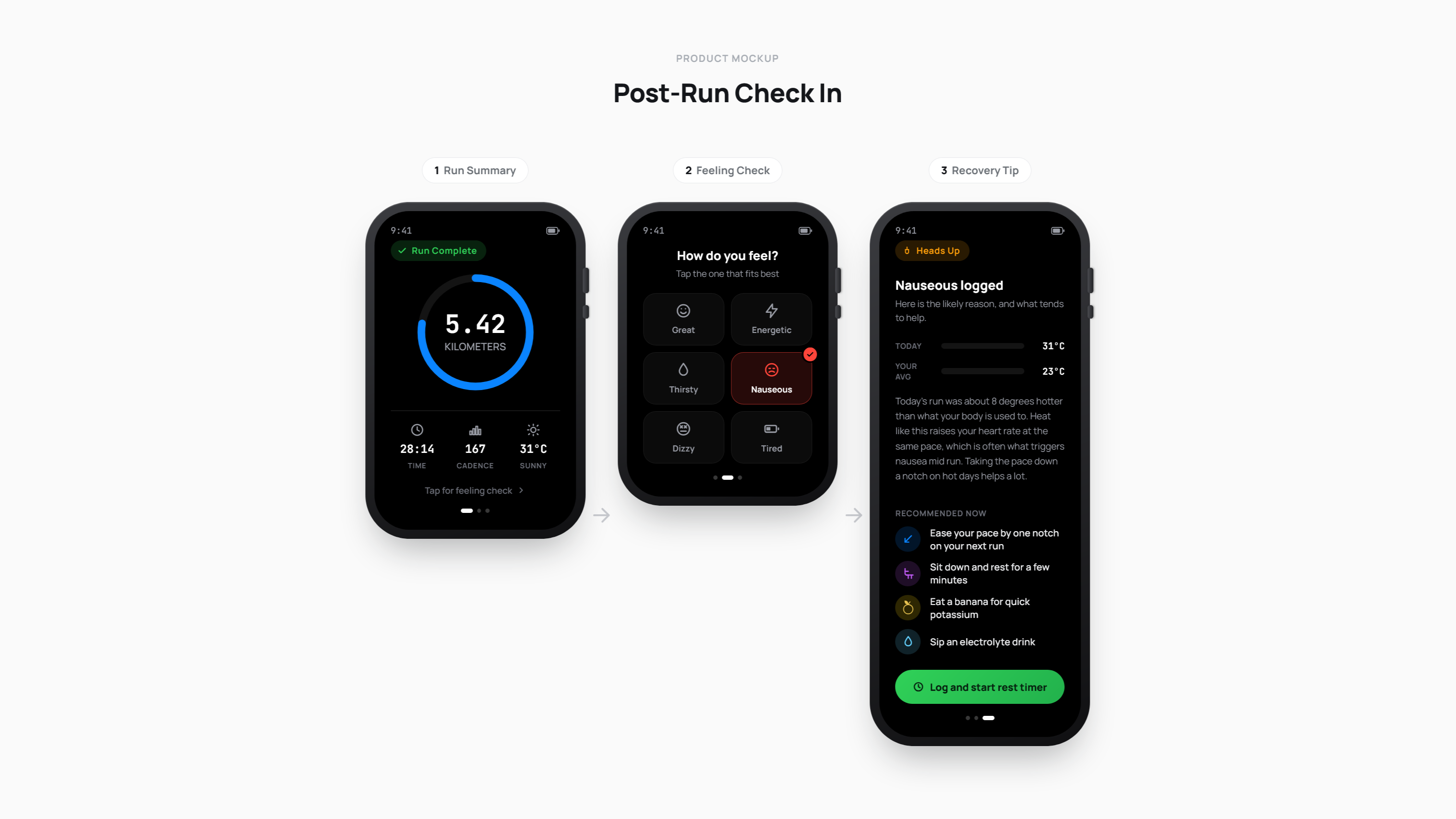
The above shows an example of a fitness app suggesting the user to eat a banana and replenish electrolytes after running in weather hotter than they normally do and stating they feel nauseous. This is a much simpler example, but still one that is rare to see in applications. It just goes to show, even with minimal data, adding a couple inputs from the user can really help bring together useful information that helps the user decide what to do next.
With the technologies we have today and the amount of data we are connected to, there isn't any reason we should not be creating stories with our data that drives action, builds trust, and reduces the need to investigate a course of action.
So the next time you start planning a data focused interface, ask yourself—what story does this data tell?
Download the framework for data storytelling
I've created this free resource that has some additional detail with a checklist that you may use for your next project.
